3.11.4.1 Starting With a Simple Rainbow
The rainbow is specified with a lot of parameters: the angle under which it is visible, the width of the color band, the direction of the incoming light, the fog-like distance based particle density and last but not least the color map to be used.
The size and shape of the rainbow are determined by the angle
and width keywords. The direction
keyword is used to set the direction of the incoming light, thus setting the
rainbow's position. The rainbow is visible when the angle between the direction
vector and the incident light direction is larger than angle-width/2 and smaller
than angle+width/2.
The incoming light is the virtual light source that is responsible for the rainbow. There needn't be a real light source to create the rainbow effect.
The rainbow is a fog-like effect, i.e. the rainbow's color is mixed with the background color based on the distance to the intersection point. If you choose small distance values the rainbow will be visible on objects, not just in the background. You can avoid this by using a very large distance value.
The color map is the crucial part of the rainbow since it contains all the colors that normally can be seen in a rainbow. The color of the innermost color band is taken from the color map entry 0 while the outermost band is take from entry 1. You should note that due to the limited color range any monitor can display it is impossible to create a real rainbow. There are just some colors that you cannot display.
The filter channel of the rainbow's color map is used in the same way as with fogs. It determines how much of the light passing through the rainbow is filtered by the color.
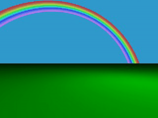
The following example shows a simple scene with a ground plane, three
spheres and a somewhat exaggerated rainbow (rainbow1.pov).
  #include "colors.inc"
  camera {
    location <0, 20, -100>
    look_at <0, 25, 0>
    angle 80
  }
  background { color SkyBlue }
  plane { y, -10 pigment { color Green } }
  light_source { <100, 120, 40> color White }
  // declare rainbow's colors
  #declare r_violet1 = color rgbf<1.0, 0.5, 1.0, 1.0>;
  #declare r_violet2 = color rgbf<1.0, 0.5, 1.0, 0.8>;
  #declare r_indigo  = color rgbf<0.5, 0.5, 1.0, 0.8>;
  #declare r_blue    = color rgbf<0.2, 0.2, 1.0, 0.8>;
  #declare r_cyan    = color rgbf<0.2, 1.0, 1.0, 0.8>;
  #declare r_green   = color rgbf<0.2, 1.0, 0.2, 0.8>;
  #declare r_yellow  = color rgbf<1.0, 1.0, 0.2, 0.8>;
  #declare r_orange  = color rgbf<1.0, 0.5, 0.2, 0.8>;
  #declare r_red1    = color rgbf<1.0, 0.2, 0.2, 0.8>;
  #declare r_red2    = color rgbf<1.0, 0.2, 0.2, 1.0>;
  // create the rainbow
  rainbow {
    angle 42.5
    width 5
    distance 1.0e7
    direction <-0.2, -0.2, 1>
    jitter 0.01
    color_map {
      [0.000  color r_violet1]
      [0.100  color r_violet2]
      [0.214  color r_indigo]
      [0.328  color r_blue]
      [0.442  color r_cyan]
      [0.556  color r_green]
      [0.670  color r_yellow]
      [0.784  color r_orange]
      [0.900  color r_red1]
    }
  }
Some irregularity is added to the color bands using the jitter keyword.

A colorful rainbow
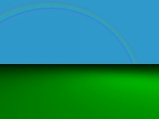
The rainbow in our sample is much too bright. You'll never see a rainbow like this in reality. You can decrease the rainbow's colors by decreasing the RGB values in the color map.

